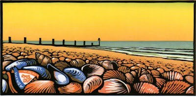
This is a fan letter to an artist whose books are an unadulterated pleasure to the eye. I’m not going to survey his entire output but focus on the books I’ve collected for myself. There is no active book illustrator who is better for clarity of design, simplicity of presentation, and vibrancy of colour. Most of his books are made for children but they all possess visual qualities to delight even the most jaded eye. A useful biographical note can be found here.
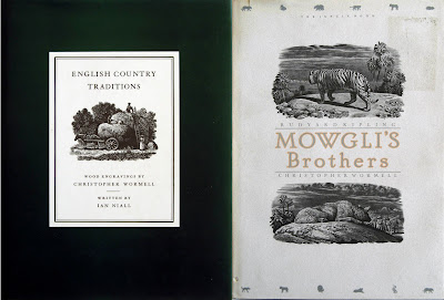
His output falls into 3 main categories. Starting in 1997 with Blue Rabbit and Friends there is an extensive series of mass market story books for children with titles like Henry and the Fox, The Saddest King, George And The Dragon, Two Frogs, and Off to the Fair. Well told tales with cheerfully competent drawings in a combination of colour washes and line, they have many qualities to make them attractive to children but they lack the visual impact that makes the large picture books so distinctive. This is not intended to be dismissive but simply to place them in context. Next is a smaller group of books illustrated in a traditional wood engraving manner. Examples of this include Mowgli's Brothers and English Country Traditions. These productions reflect a high degree of technical mastery and a genuine respect for a traditional craft. The ability to render form and texture in this most demanding medium is admirable but overall they are not so effective when it comes to visual rhythms and a sense of movement. The surfaces and forms seem to exist in an airless atmosphere; they need a fraction of additional space into which to expand and animate. Finally, there is a growing series of large format primers with bold and dynamic full page colour illustrations. These are by some distance his greatest achievements and maintain the highest overall standard of quality.

This series began in 1990 with the publication of An Alphabet of Animals. It established a generously proportioned square format with full page four colour lino-cut illustrations with black borders which with some modifications has lasted to the present. The appeal of apparent simplicity and the revitalization of a traditional form was immediately recognised and the book won the Graphics Prize at the Bologna Book Fair in 1990. A Number of Animals followed in 1994, published by Jonathan Cape in a yellow embossed cloth binding with a wraparound pictorial dust jacket displaying an image not included in the body of the book. This volume introduced the device of a small character (a chick in this case) that appears somewhere in every image. The practice has been maintained through the life of the series and makes a minor but continuing contribution to the sense of visual wit inherent in the work.
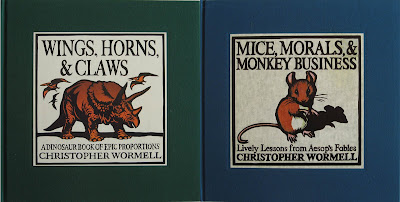
The series continued with the New Alphabet of Animals in 2000 and Teeth, Tails and Tentacles in 2004. Mice, Morals and Monkey Business was published in 2005, followed by Through the Animals’ Eyes in 2006. The latest volume, Wings, Horns and Claws appeared in September 2007. Handsomely produced in cloth bindings with printed labels inlaid on the front, these books have been published by the Running Press in Philadelphia and there is no sign as yet that the formula is becoming stale. The design and page layouts have an air of classic simplicity that allows the images to speak for themselves. The books have a sense of internal rhythm created by alternating single images and double page images interspersed with text. The images are then repeated either as vignettes at the back with additional text or employed on reduced scale between the endpapers and the title page. This all serves to enhance the process of absorbing the imagery.

CW learned his wood engraving skills from his father and never attended art college. He is largely self taught but has a keen awareness of the long traditions of book illustration for children. There is an interview in which he talks about this and other matters that can be read by clicking here. There are echoes in his work of Japanese wood-block prints and some affinities with the prints of Bonnard and the woodcuts of Raoul Dufy. Like Dufy in his illustrations to Apollinaire’s Le Bestiaire, he is a master of the power of line, controlling the width, weight and direction to describe and enclose form and texture as well as intensifying colour sensation. Image placement in relation to the pictorial frame is judged with perfect finesse. Decisions about whether to contain a form within the frame or whether to crop are expertly made. Even more impressive is the unerring ability to make the areas of flat saturated colour, the negative shapes, work to maintain tension in the image. It is this quality that is reminiscent of Bonnard especially when large and small forms are contrasted within the same image. All these, in combination with a flair for developing movement within the image are calculated to exercise and delight the eye.

I also have a few items that lie outside these three categories of book. Mediterranean Flavours is a cookbook, published in 1995 and lavishly illustrated in colour lino-cuts by CW. The images of tomatoes and aubergines, peppers and olives, lemons and pomegranates and sardines and squid ornament the pages with wonderfully intense colour contained within supple and rhythmic contours. Labels is a small card covered 34 page book, published in 1997 with a text by Louis de Bernières, a brief first person narrative describing an unlikely instance of compulsive behaviour leading to wealth and fortune. CW contributed small atypical line drawings, one to sit opposite each page of text plus a more characteristic single colour lino-cut on the book’s theme of tinned cat food to decorate the front and back cover.
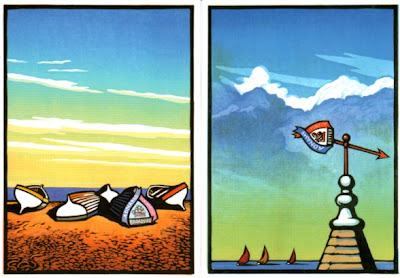
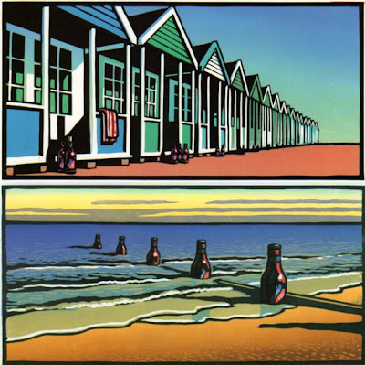
In 2005 Adnams Brewery launched a poster and magazine advertising campaign under the slogan, “Beer From The Coast” with full colour seaside imagery from CW. I saw them first as full page ads in the Guardian Weekend magazine where they positively leapt off the page, surrounded as they were by the usual visual mediocrity. On a train trip a few months later I saw them as full size posters effortlessly dominating the suburban platforms along the track leading to Waterloo. Once again, they looked stupendous, in a class of their own in the company of ads for mobile networks and financial services. Adnams made much of this rich vein of material on their website and for a while were marketing prints, postcards, mouse mats and mugs bearing CW’s images. The posters brilliantly evoke the breezy, sunlit horizons of the East Anglian coast in a series of visual puns in which bottle tops stand in for pebbles, shells, limpets, and sails while beer bottles stand in for bollards and groynes. It was an opportunity for CW to make use of a pictorial language hitherto exclusively applied to natural forms, on the built environment and man-made objects. Contemporary illustrators rarely get an opportunity like this and seeing his work widely reproduced on such a massive scale must have been a source of great satisfaction. Adnams is a family firm with a long established reputation for high quality traditional real ales. Linking up with an artist and illustrator with a flair for distinctive imagery and a respect for the traditions of his craft seems like the perfect partnership.

No comments:
Post a Comment